
MGA2 Logo Design


Description
Marketing Group/MGA2
 When Marketing Group took a digital turn, so did the logo. I was tasked with using a font I'm not fond of. Either version of it depending on font company (who knows that answer?)
I came up with MGA2 first, and after a year, I was asked why I made the MG and the A2 in different spaces. It was pure design, off-set the letters using the negative space to form the A.
"It looks like we're not 1 unit, 1 company, change it."
MGA\\ was my second version. Again, same bad font...new look. Creative for both versions, I must have 100's of variations and ideas on paper, post-its and envelopes in the car.
I like where each design ended up, both versions. We even hung it on the wall after all said and done.
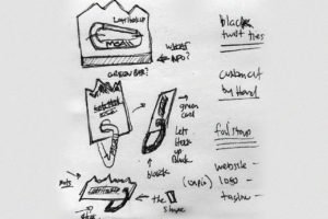
The carabiner card idea came from the website re-design. Working with a printing company under the same roof for 20 years, (AmericorPress) they saw I had an issue with drilling the hole clean. Always looking to add something special to any printed piece, Print Manager Allen Nace simply said, "Get a grommet"
I think it made the card complete.